Typography
Table of Contents
Type Scale
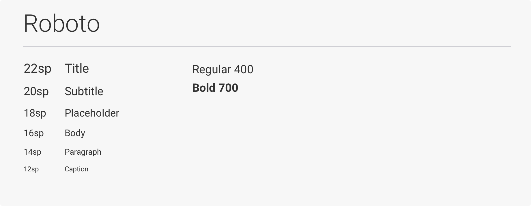
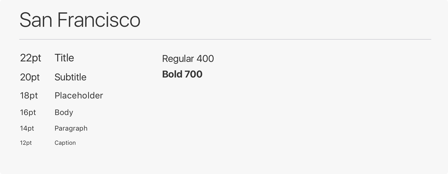
The type scale for the native SDK is using the system font based on device. For Android, the system font is Roboto and for iOS, the system font is San Francisco.
Android SDK system font type scale
iOS SDK system font type scale
Font Colours on Light Backgrounds
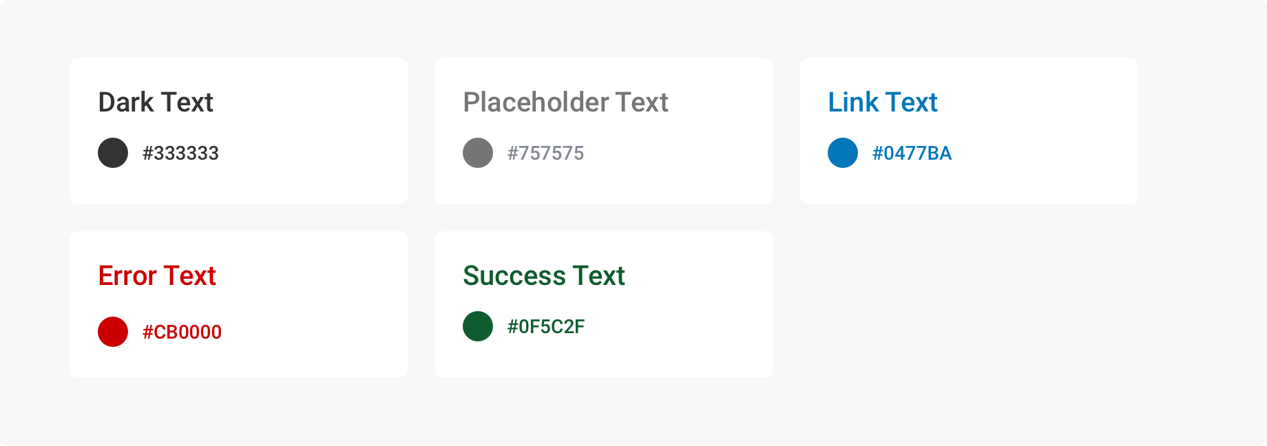
Colour is applied sparingly to text in the Native SDK to ensure WCAG AA Level standard for accessibility. Dark text is used for main blocks of text in the interface and in cases where text is overlaying light colour components.
Font Colours on Colour Backgrounds
By default, light or dark text should be used on colour backgrounds. Light text should be used on colour backgrounds when the contrast ratio meets the WCAG recommended 4.5:1 for normal text and 3:1 for large text.
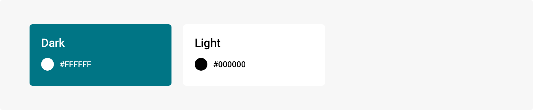
Light and Dark text colours and sample custom text colour on colour backgrounds that pass AA level accessibility standards.
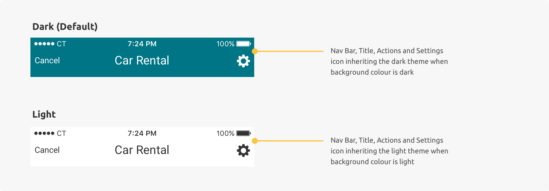
Theming Examples
By default, the colour for text and icons on colour backgrounds are white for the native SDK. If your brand colours are a bright colour (high luminosity), it is recommended you change to a light theme for legibility of text and icons.