Themes
Table of Contents
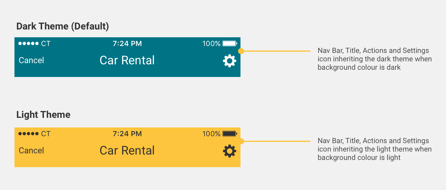
By default, the colour for text and icons on colour backgrounds are white for native SDK. If your brand colours are a bright colour (high luminosity), it’s recommended you change to a dark text theme for legibility of text and colours.
Styling the SDK and Initialising your Theme
The Android SDK uses the Material Day Night theme Theme.MaterialComponents.DayNight
The following code snippet will show you how to style the app to suit your brand guidelines.
<style name="SampleTheme" parent="CTDayNightTheme">
    <!-- The primary colour -->
    <item name="colorPrimary">@color/primaryColor</item>
    <!-- Colour applied on primary -->
    <item name="colorOnPrimary">@color/textColor</item>
    <!-- The primary variant colour (light or dark) -->
    <item name="colorPrimaryVariant">@color/primaryVariant</item>
    <!-- The status bar colour -->
    <item name="android:statusBarColor">@color/statusBar</item>
    <!-- The secondary colour -->
    <item name="colorSecondary">@color/secondaryColor</item>
    <!-- Colour applied on secondary (used for CTA buttons) -->
    <item name="colorOnSecondary">@color/textColor</item>
    <!-- Colour applied for selection states, toggles etc.. -->
    <!-- You can style it to colorSecondary if doesn’t apply to your case -->
    <item name="colorSecondaryVariant">@color/secondaryVariant</item>
</style>
Once you have completed styling your theme, you can initialise the theme in the SDK builder as follows:
val sdkDataClientIdXYZ = CTSdkData.Builder(clientId = clientId)
    .theme(R.style.SampleTheme)
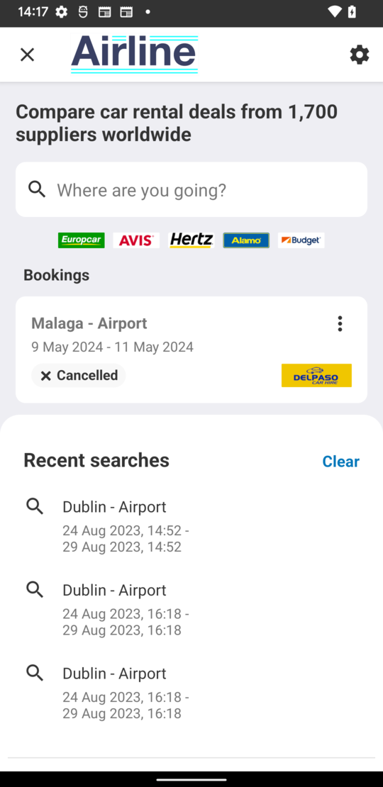
Setting an Image as the Landing Page Toolbar
The Car Hire title in the toolbar on the landing screen can be replaced with a drawable. The recommended height for this image is 44dp.
To make use of this feature, please set the ctLandingTopBarImage properties on your theme:
<style name="SampleTheme" parent="CTDayNightTheme">
    <!-- other configuration style items -->
    <item name="ctLandingTopBarImage">@drawable/your-drawable-here</item>
</style>
Setting a Custom Font
In order to set a custom font on your theme you need to add the fonts to the res/font directory along with a my_custom_font_family.xml file, see below for an example:
<?xml version="1.0" encoding="utf-8"?>
<font-family xmlns:android="http://schemas.android.com/apk/res/android"
  xmlns:app="http://schemas.android.com/apk/res-auto">

  <font
    app:fontStyle="normal"
    app:fontWeight="400"
    app:font="@font/my_normal_font" />
  <font
    app:fontStyle="italic"
    app:fontWeight="400"
    app:font="@font/my_italic_font" />
</font-family>
Your font-family can then be added to your theme:
<item name="android:fontFamily">@font/my_custom_font_family</item>
Optional Colour Overrides
You can override the following SDK attribute defaults if required:
<!--Default Colours-->

<!-- We recommend you keep the defaults -->
<item name="android:windowBackground">@color/CT_White</item>
<item name="android:colorBackground">@color/CT_Grey_Light</item>
<item name="colorError">@color/CT_Red</item>
<item name="colorOnError">@color/CT_Red</item>
<item name="colorSurface">@color/CT_White</item>
<item name="colorOnSurface">@color/CT_Black</item>
<item name="colorOnBackground">@color/CT_Black</item>

<!-- Customisable colours -->

<!-- This is the attribute for text link colour -->
<item name="ctTextLinkColor">@color/CT_Blue</item>
<!-- This is the attribute for the horizontal progress bar on the availability screen. -->
<!-- If you have a white primary colour, we recommend you override this in the theme and use your secondaryColor -->
<item name="ctProgressBarColor">?colorPrimaryVariant</item>
<!-- This is the attribute for the car illustrations on landing and booking confirmation screens -->
<item name="ctIllustrationColor">?colorPrimaryVariant</item>