SDK Theming
Table of Contents
Colour Theming
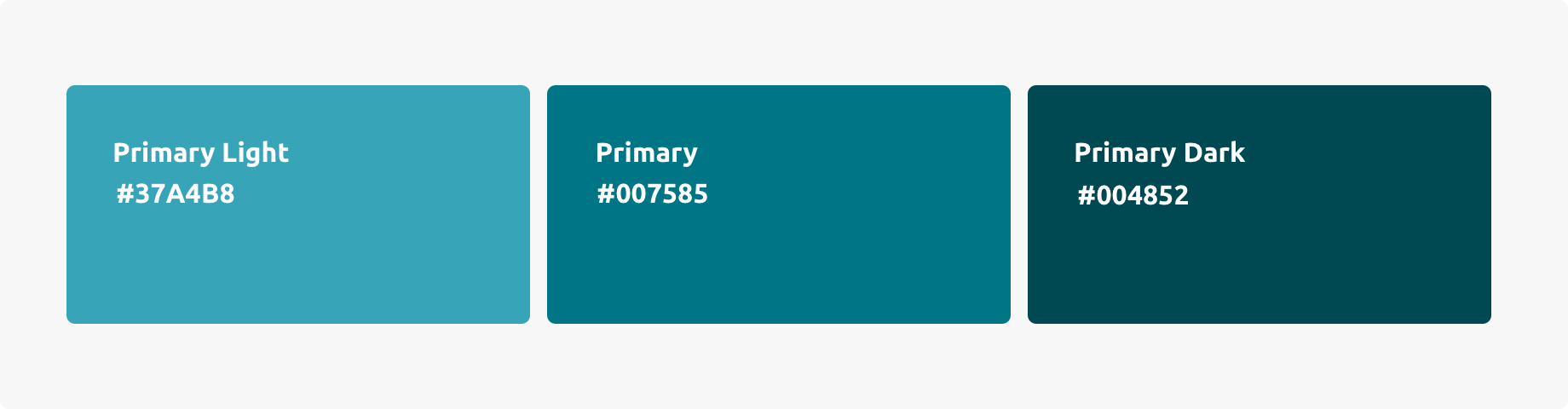
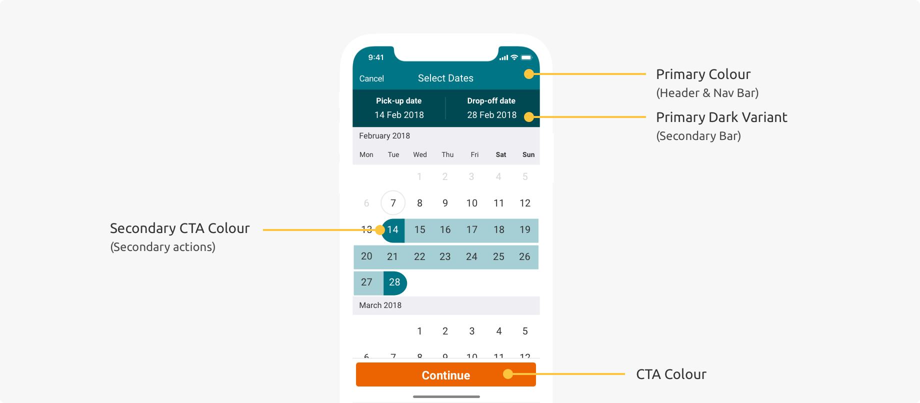
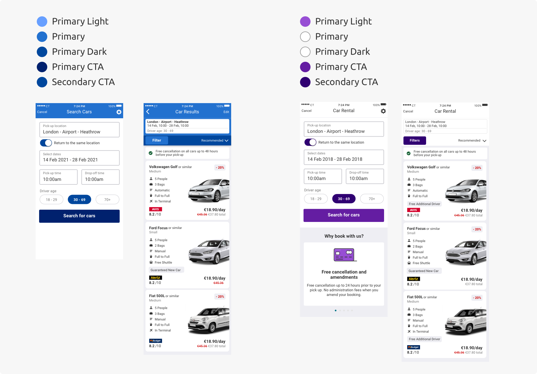
Primary Color
The primary color is the color displayed most frequently across the SDK’s screens and components.
Primary Light & Primary Dark Colours
We recommend using a light and dark variant of your primary colour for the product. This is useful for creating contrast between UI elements, such as distinguishing a header bar from a secondary panel bar.
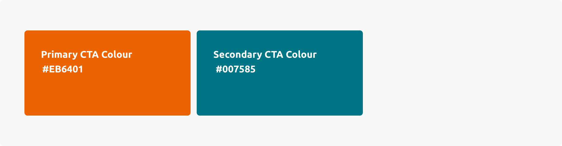
CTA Colours
The CTA color provides another way to distinguish the product and highlights the primary actions in the UI. Having a secondary CTA color is optional, and it is applied sparingly to highlight secondary actions in the UI.
Colour Hierarchy
Having a colour theme creates a hierarchy in the UI. Too much colour will distract the user and take them away from the most important information and actions in the UI. Colour is used with intention and it is only used for certain components and elements.
Theming Examples
Below are examples of applying a palette to the SDK’s Search and Car Results screens.
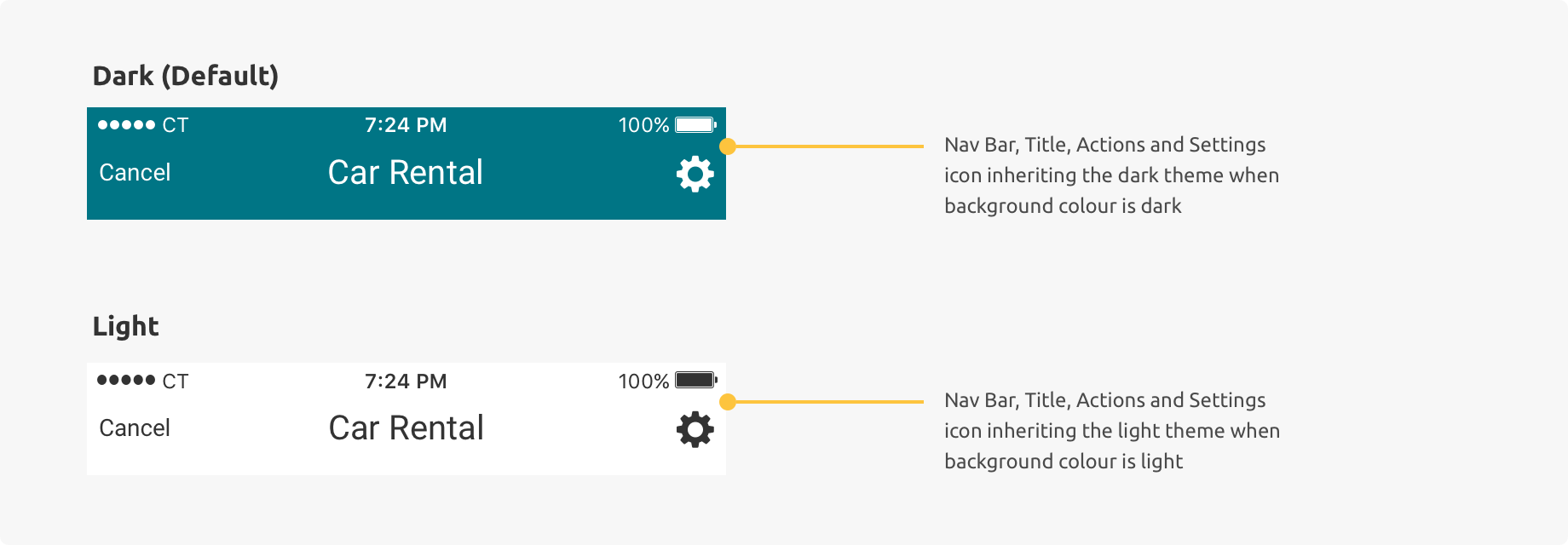
Dark vs. Light Styling
By default, the colour for text and icons on colour backgrounds are white. If your brand colours are a bright colour (high luminosity), it is recommended you change to a light theme for legibility of text and icons.
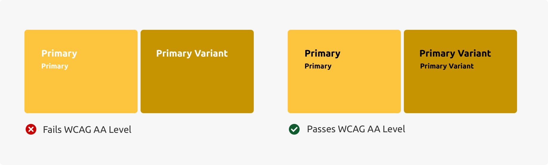
Accessibility
We recommend meeting WCAG AA Level for background colours, text and icons. For colours used on backgrounds of components, a contrast ratio of at least 4.5:1 for normal text and 3:1 for large text is recommended.
The SDK components with colour use white as the default overlay text colour. If your brand colour does not meet the recommended contrast ratio with white text, we recommend using dark text to meet this contrast ratio.
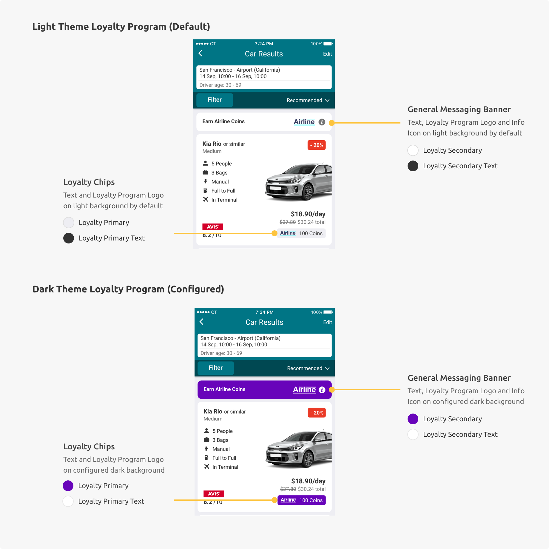
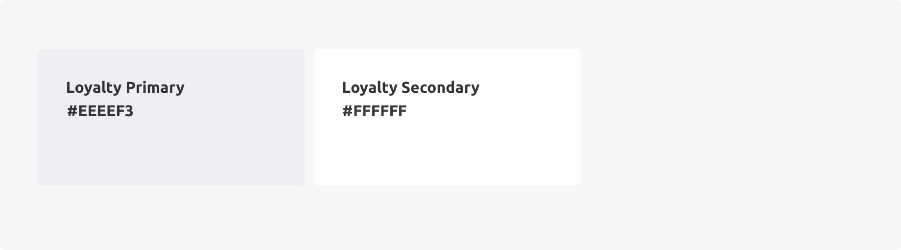
Loyalty Program Theming (Optional)
This section is only relevant for partners with a loyalty program. By Default, your loyalty program logo and details will sit on a light background (Light Grey or White).
It is not required, but you can change the background colour and the text/icon colour of loyalty components to fit in with your app’s loyalty program branding. Loyalty components include a general messaging banner and more car and specific loyalty chips. See more on the components section of this style guide.
Similar to SDK theming, if you are changing the background colour to a dark background (and configuring the loyalty program as a dark theme), it is recommended you change the text and icon colour to a lighter colour for legibility. The SDK will change the Loyalty Program logo automatically for loyalty dark theme and light theme.
The loyalty logo must stay the same on loyalty components, so make sure the configuration is set so that all logos are legible and have sufficient contrast on background colours selected.