Supplier Benefits
On the vehicles list a banner may be shown to the user to allow them to apply some promo/discount codes. This banner can be customized as you wish as described below.
Table of Contents
Applying the theme
Override the following properties in your SDK theme
<style name="CarTrawlerSDKTheme" parent="CTDayNightTheme" >
//..
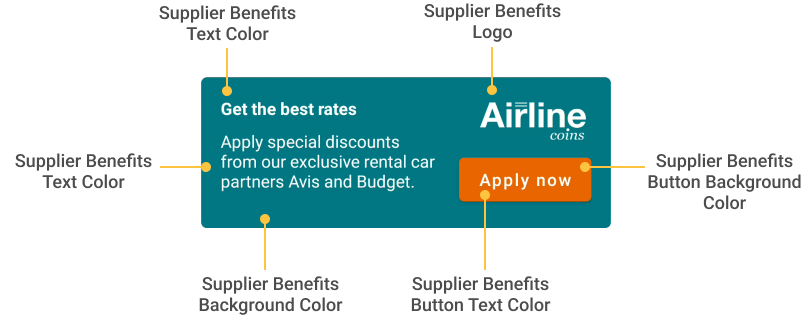
<item name="ctSupplierBenefitsLogoURL">https://www.mylogo.com/mylogo.png</item>
<item name="ctSupplierBenefitsBgColor">@color/bannerBgColor</item>
<item name="ctSupplierBenefitsButtonBgColor">@color/bannerButtonBgColor</item>
<item name="ctSupplierBenefitsButtonTextColor">@color/bannerButtonTextColor</item>
<item name="ctSupplierBenefitsTextColor">@color/bannerTextColor</item>
</style>
For the logo url you can provide a local drawable instead of a remote url. All you need to do is use the following attributes:
<style name="CarTrawlerSDKTheme" parent="CTDayNightTheme" >
    <item name="ctSupplierBenefitsLogoImage">@drawable/my_logo</item>
</style>
If you provide both a drawable and a url the drawable will take priority, so your url will never be used.
If you don’t provide any attributes for the logo, the component that shows the logo will be hidden (View.GONE)
Fallback Colors
By default our CTDayNightTheme will use the following colors if partner doesn’t initialise them
<style name="CTDayNightTheme" parent="Theme.MaterialComponents.DayNight.NoActionBar">
    <item name="ctSupplierBenefitsBgColor">?colorPrimary</item>
    <item name="ctSupplierBenefitsButtonBgColor">?colorSecondary</item>
    <item name="ctSupplierBenefitsButtonTextColor">?colorOnSecondary</item>
    <item name="ctSupplierBenefitsTextColor">?colorOnSecondary</item>
</style>
Auto enabling Supplier Benefits During SDK initialisation
The CTSdkData builder’s enableSupplierBenefitAutoApplyCodes allows Partners to initialise the SDK and opt in to apply ALL automatic codes that can be applied for suppliers. It is optional.
val sdkDataClientIdXYZ = CTSdkData.Builder(clientId = clientId)
    .enableSupplierBenefitAutoApplyCodes()