Loyalty
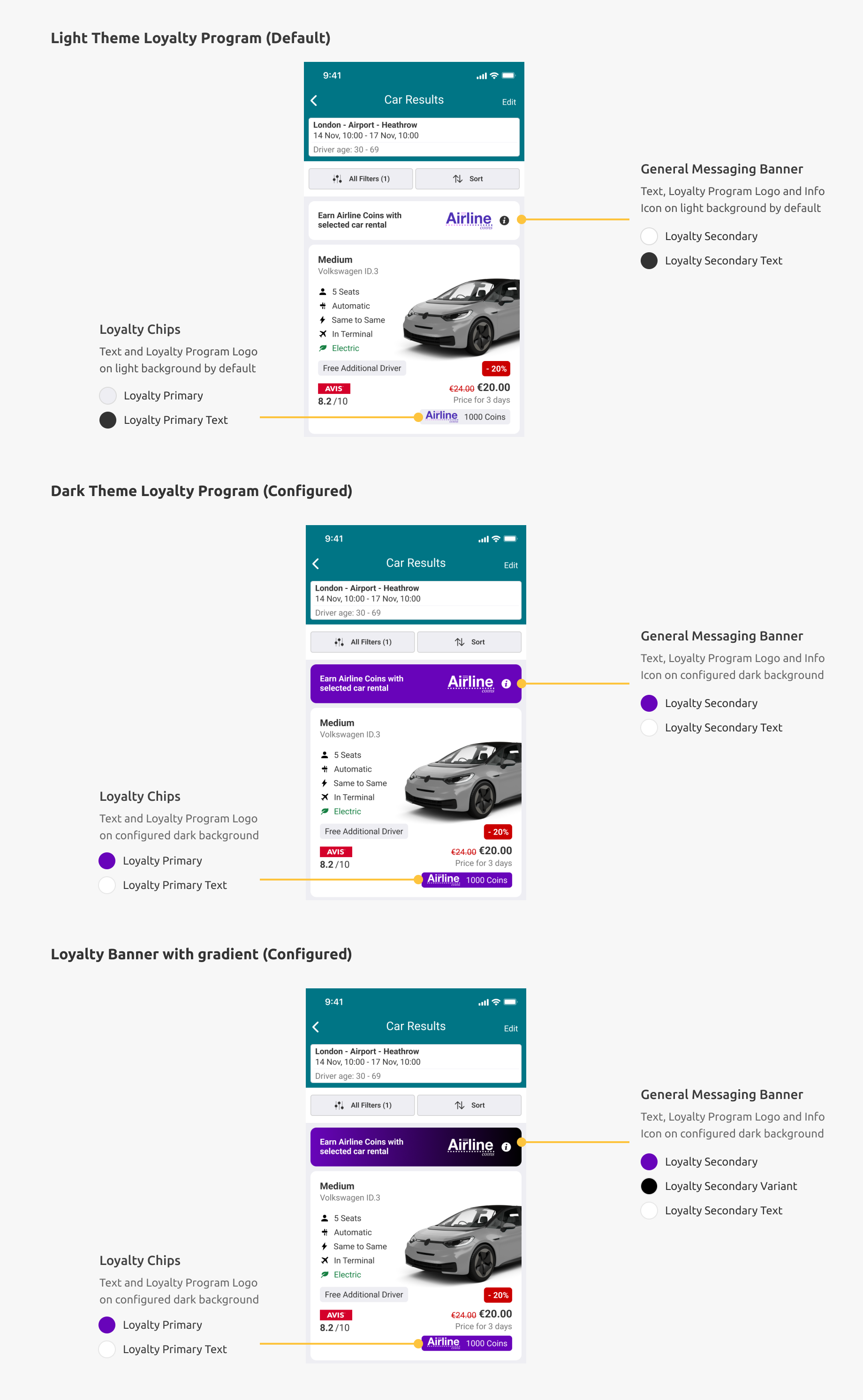
The colour of the background, text, and icon on our loyalty components can be changed to fit in with your app’s loyalty program branding. Loyalty components include banners as well as specific loyalty chips. See more on the components section of our style guide.
Table of Contents
Similar to SDK theming, if you are changing the background colour to a dark background (and configuring the loyalty program as a dark theme), it is recommended you change the text and icon colour to a lighter colour for legibility. The SDK will change the Loyalty Program logo automatically for the loyalty dark theme and light theme.
Theme Defaults
The default is light and theme values are as follows:
| Attribute | Color |
|---|---|
| Primary Color | |
| Primary Text Color | |
| Secondary Color | |
| Secondary Text Color | |
| Secondary Variant Color | Defaults to Secondary Color attribute |
Dark mode defaults
The default is dark and theme values are as follows:
| Attribute | Color |
|---|---|
| Primary Color | |
| Primary Text Color | |
| Secondary Color | |
| Secondary Text Color | |
| Secondary Variant Color | Defaults to Secondary Color attribute |
CTLoyaltyTheme
Light Theme
Apply light to apply a dark logo for the light theme.
Dark Theme
Apply dark to apply a light (white) logo for the dark theme
Applying the Theme
Override the following properties in your SDK theme
<style name="CarTrawlerSDKTheme" parent="CTDayNightTheme" >
    //..
    <item name="ctLoyaltyPrimaryColor">@color/loyaltyPrimaryColor</item>
    <item name="ctLoyaltyPrimaryTextColor">@color/loyaltyPrimaryTextColor</item>
    <item name="ctLoyaltySecondaryColor">@color/loyaltySecondaryColor</item>
    <item name="ctLoyaltySecondaryColorText">@color/loyaltySecondaryColorText</item>
    <item name="ctLoyaltyTheme">dark</item> // Either "dark" or "light" Default is "light"
    <item name="ctLoyaltyChipSize">regular</item> // Either "regular" or "large" Default is "regular"
</style>
Loyalty Chip Size
The chip’s height can also be increased if your logo requires more padding. The default size of the chip is regular. 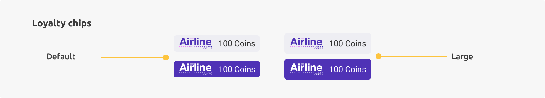
This can be changed to large as follows:
<style name="CarTrawlerSDKTheme" parent="CTDayNightTheme" >
    //..
    <item name="ctLoyaltyChipSize">regular</item> // Either "regular" or "large" Default is "regular"
</style>
Loyalty Banner Landing Screen
The template of the loyalty banner on the landing screen can be modified. There are two templates available “Default” and “Logo & Text”. The latter is a full width text with a central logo and an optional gradient background.
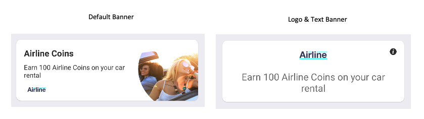
The Logo & Text template can be styled as follows:
Create a style for the banner:
    <style name="ctLoyaltyLandingBannerStyle">
        <item name="ctBannerTemplate">logoAndTextBanner</item> // Either "defaultBanner" or "logoAndText". Default is "defaultBanner"
        <item name="ctBannerBackgroundColor">?colorPrimary</item> // Defaults to the theme's colorPrimary
        <item name="ctBannerSecondaryBackgroundColor">?colorSecondary</item> // Defaults to the theme's colorSecondary
        <item name="ctBannerTextColor">@android:color/white</item> // Defaults to Android's white color
        <item name="ctBannerInfoButtonColor">@android:color/white</item> // Defaults to Android's white color
        <item name="ctBannerImageDrawable">@drawable/your_logo</item> // If not set, it retrieves it from the Loyalty API
        <item name="ctBannerFont"> // Optional custom font
    </style>
Add the new style to the theme:
<style name="CarTrawlerSDKTheme" parent="CTDayNightTheme" >
    //..
    <item name="ctLoyaltyLandingBannerStyle">@style/ctLoyaltyLandingBannerStyle</item>
</style>